Purpose:
The Dashboard view is the first screen you see once you've logged into Webgility Desktop. This view gives you a high-level analytical view of how the selected store is performing.
Graphs:
The graphs in the upper row display gross sales revenue, profit margins, and expenses over time. The two graphs in the bottom row show top-selling products and top regions for sales.
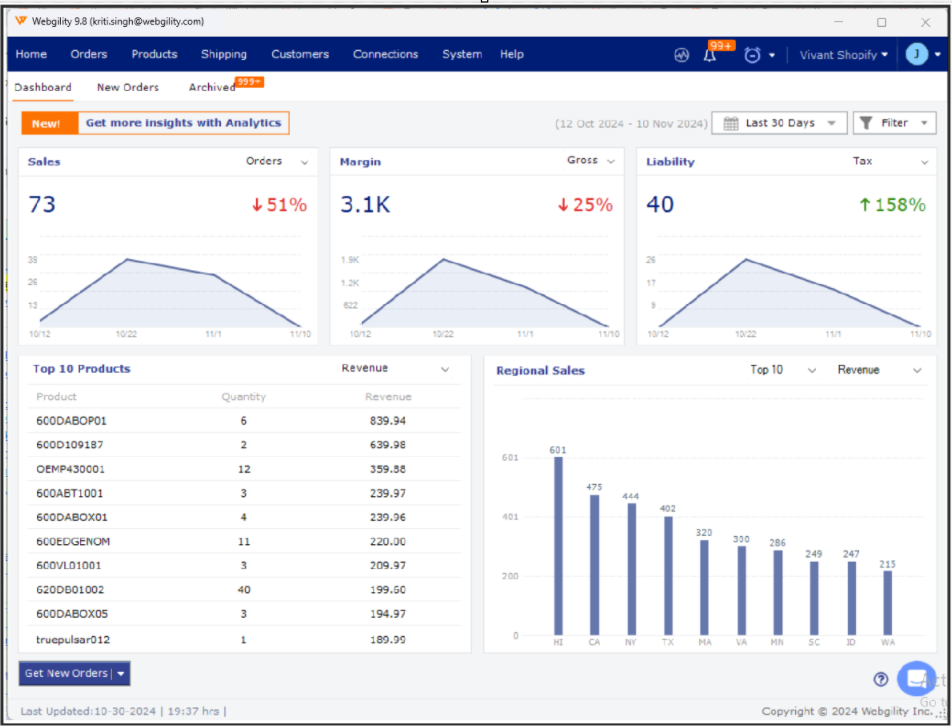
Date Filter:
The date filter allows the user to change the date range of the graphs and allows a user to compare current data to previous data. For example, current month to date versus previous month to date.
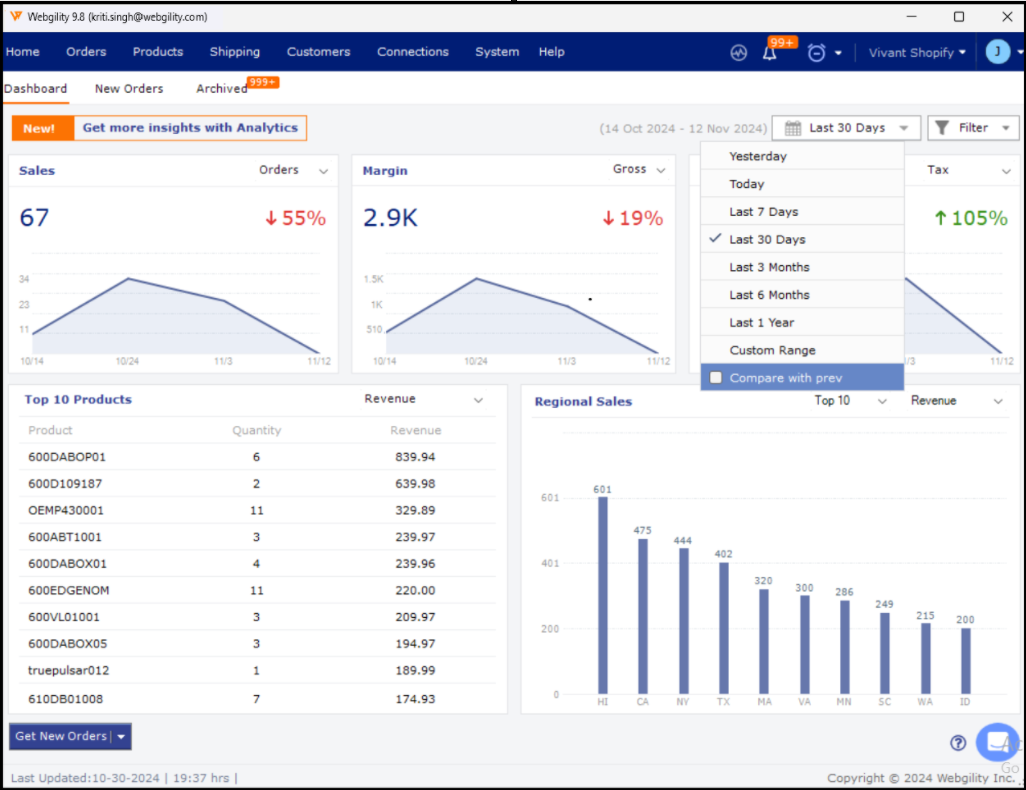
This filter section to the right of the date selection tool allows the user to filter out orders of a specific status.
Note: By default, canceled orders are not included in the data.